


The Math Intercept 11
Math Intercept returns with curved countries, Azadi Tower, Pythagorean puzzles, Hilma af Klint and more...

Hey everyone, it has been a while. Since the last time, I moved to Osaka. I loved Yokohama a lot but now I am an Osakan! Yokohama is larger than Osaka, (about 1.5 times) and a bit more modern to be honest. However Osaka has its distinct Kansai culture, with friendly, humorous, and sometimes down-to-earth people. I do not doubt that I will like life here.
I couldn't get back to the newsletter due to the excitement of moving and very heavy workload after the sweet slowness of the summer vacation. Nevertheless I cannot break away from Substack and the world of mathematics. I decided to continue this free newsletter. Here is The Math Intercept 11. I hope you like it.

Recently the Ministry of Education, Culture, Sports, Science, and Technology (MEXT) of Japan reported a record-high number of 346,482 students who missed 30 or more days of school during the 2023 academic year. This figure represents a significant increase of 15.7% from the previous year. This is the eleventh consecutive year of rising in absenteeism in schools. Compared to a decade ago, elementary school non-attendance has surged by 5.4 times, while junior high school non-attendance has doubled.
In another post last week, I had shared another survey showed a major percentage of kids from poor families not enjoying the school.

Atlasova shares amazing maps on their social media platforms. In one of the recent ones, they are measuring the curviness of Chile and Australia. This is an exciting perspective and those are such cool graphics.


I recently discovered the following factorization diagram by Brent Yorgey. This innovative arrangement represents numbers 1 to 100 using color codes. This is a great visualization as it shows prime factor decomposition of numbers and a great tool to teach or learn prime numbers.

Math Eyes: Lion's mane jellyfish

If there is a perfect photo, the above is the one. Kudos to the photographer Shane Gross. The eight-spike star shape gives the vibe of two squares intersecting with an ideal color combination.


With its unique design and innovative engineering at the time of its construction, Azadi Tower is one of Iran’s iconic landmarks, and was commissioned to celebrate the 2500th year of the Persian Empire. The geometric details are fascinating as you can see. The inverted Y-shape structure of the architecture made it a challenging task for the engineers, in addition to seismic worries due to the region active earthquake history. The tower was successfully inaugurated in 1971, becoming a symbol of the nation's resilience amid political and geological instability.
Photo Credits and sources: be.in.iran, wikipedia, tehran.begardim, ArchDaily
Curious Puzzles
This issue’s puzzles are from the Pythagorean Theorem. Enjoy!
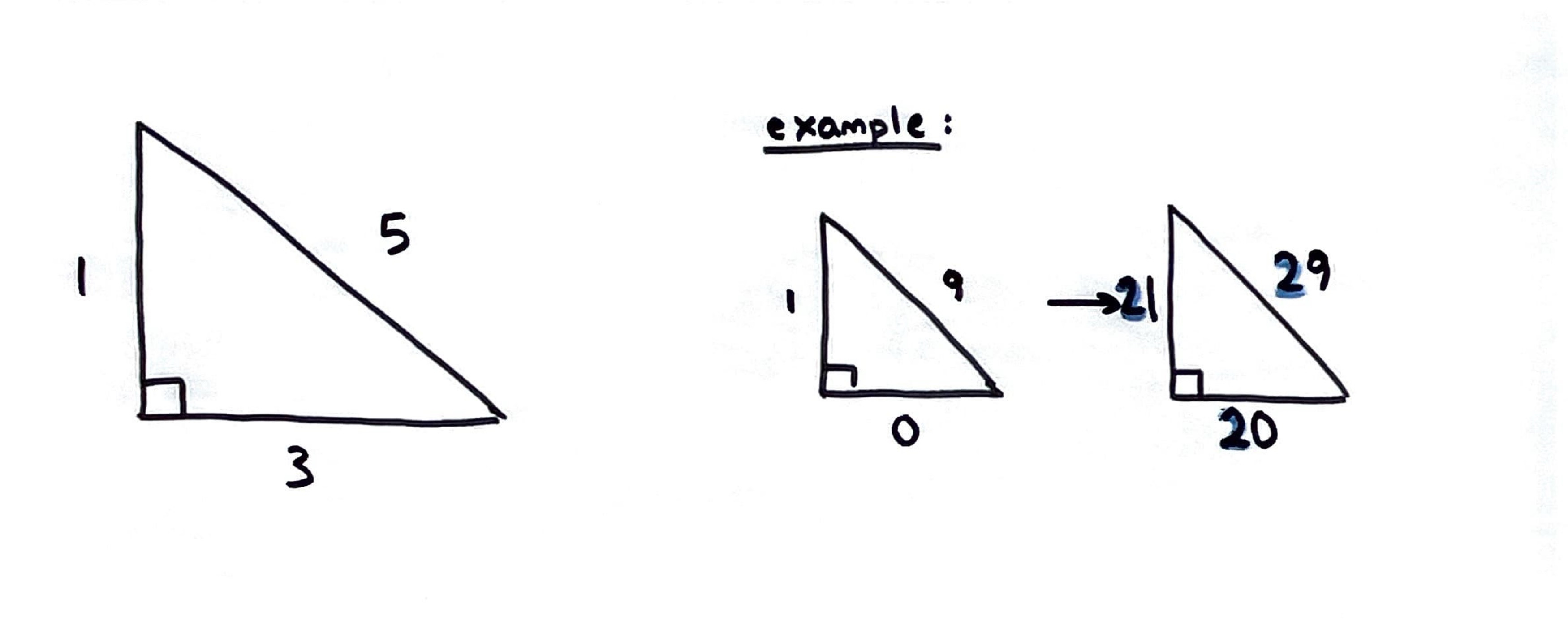
Four Triangles:
I drew four right-angled triangles. The hypotenuse of my first triangle was also the shortest side of my second triangle; the hypotenuse of my second triangle was also the shortest side of my third triangle; the hypotenuse of my third triangle was also the shortest side of my fourth triangle. The length in millimeters of each side of each triangle was an integer less than 100.
What were the lengths of the shortest and the longest sides that I drew?
Source: Enigma Code
Using the digits 1 to 9, at most one time each, fill in the boxes to find the lengths of the missing sides.
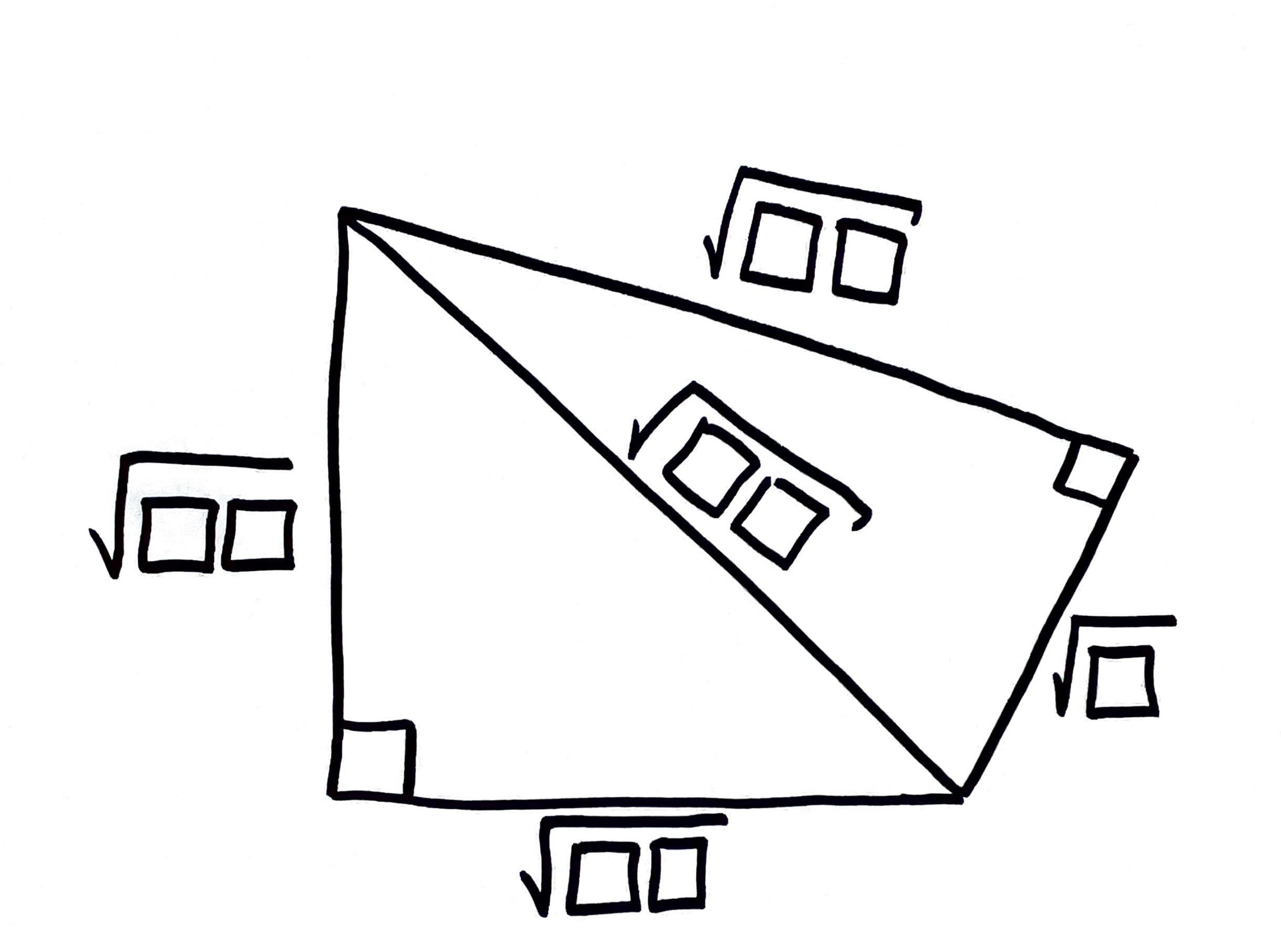
3. The following right-angled triangle side lengths are mistaken. Add the same digit to all sides to maintain a valid measurement.
Answer to the previous issue’s puzzle
Proofs Without Words


Math In Action

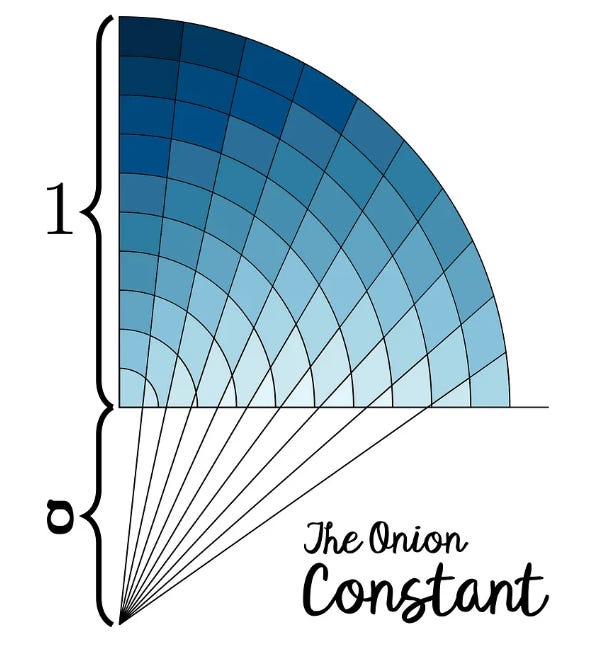
J. Kenji López-Alt, a cookbook editor at the New York Times, tries to find a mathematically best way of cutting an onion. He first describes the classical method of cutting the onion into small cubic pieces by horizontal and vertical strokes. Then he refers to the Lyonnaise cut in which the knife strokes follow the radial symmetry of the onion. (here is an example). Next, he works with a mathematician, Rui Viana, and they model the onion cuts in different geometric styles. Dylan Poulsen improves this model and coins the term, the onion constant! 😆. In the end, Lopez-Alt explains, there is no ideal way, but this is quite an interesting piece to read.
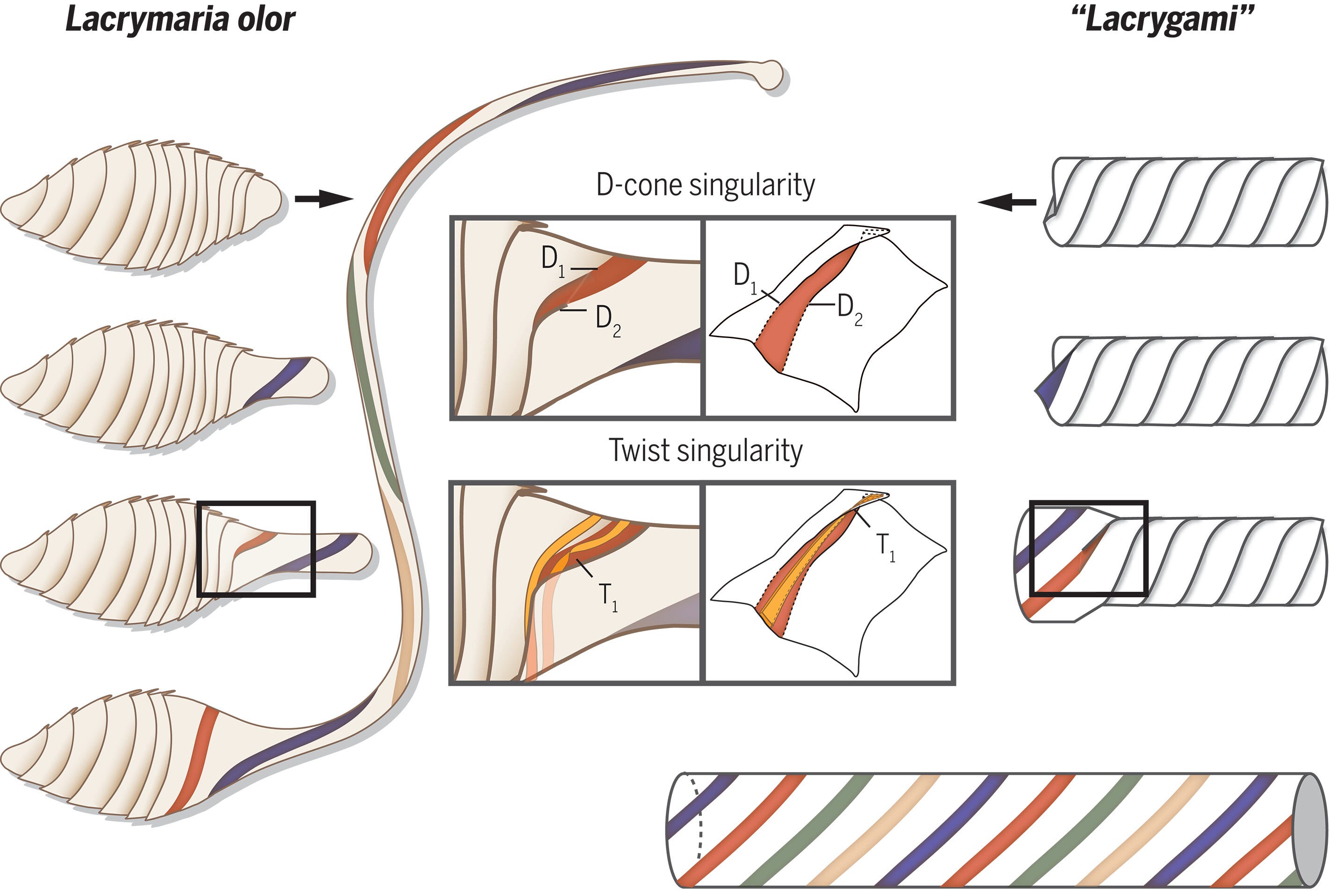
The single-celled freshwater predator, Lacrymaria olor, utilizes a remarkable origami-like mechanism to extend its neck up to 30 times its original length. This enables it to capture and consume other microorganisms. Origami, often considered a simple paper folding art, is actually a fascinating blend of creativity and mathematics, and surprisingly quite common in the nature, too. You can read more details of this research here.

Various mathematical models developed by researchers continue to help a better understanding to the problems we try to solve as humanity. Some of these, that I recently read on Science Daily and Phys.org include better understanding of prostate cancer, finding potential solutions to food crisis, predicting crystal structures in a few hours rather than months, and revealing the shape of a single photon.
Math Art: The Altarbild by Hilma af Klint [1915]

One of the pioneers of cubism, Hilma af Klint, was a Swedish artist. Her art included spiritual elements. Her paintings often feature vibrant colors, geometric shapes, and symbols, representing cosmic forces and spiritual evolution.
In af Klint’s pictorial universe, the semiotic level is never radically separated from the world of visual forms; her cosmic figures send out mysterious linguistic messages that, as a mystic, she seemed to channel from another dimension, often referring to herself in the second or third person. One of the spirits told her: “You are called to present in pictures a wonderful linguistic system that we term the influence of miraculous powers on people’s outer and inner lives. True, the pictorial language comes from the Orient, but it will be illuminated by a northern light and will be explained in conjunction with outer signs and inner life.”
Daniel Birnbaum, Artforum
Image credits: The Guardian
What is going on in this graph?

Airline business is surely a complex one. Lirim Zenuni uses a Sankey diagram and breaks down the revenue and expenses of a hypothetical 10-hour flight, showing how much money an airline makes after accounting for various costs.
The left side of the diagram shows the total revenue and on the right side, we see the expenses.
150 seats from the economics class bring the same revenue as 30 business and first-class tickets combined. The revenue is 250,000 USD. The operating expenses are categorized as fuel costs, labor costs, airport fees, and catering and onboard services. Considering also the depreciation and other costs limit the profit to about $40,000 per flight. Seems nice, however, this is a 10-hour hypothetical flight. There must be many other factors such as the length of the flight, the route, the type of airplane, and the airline. Still, the infographics give us a good picture of understanding the dynamics of this business.
Mathemania

.jpg)
This is all from this time. I hope you enjoyed reading the Math Intercept.
Read more: